Hooks N’ Feathers
Visual brand identity
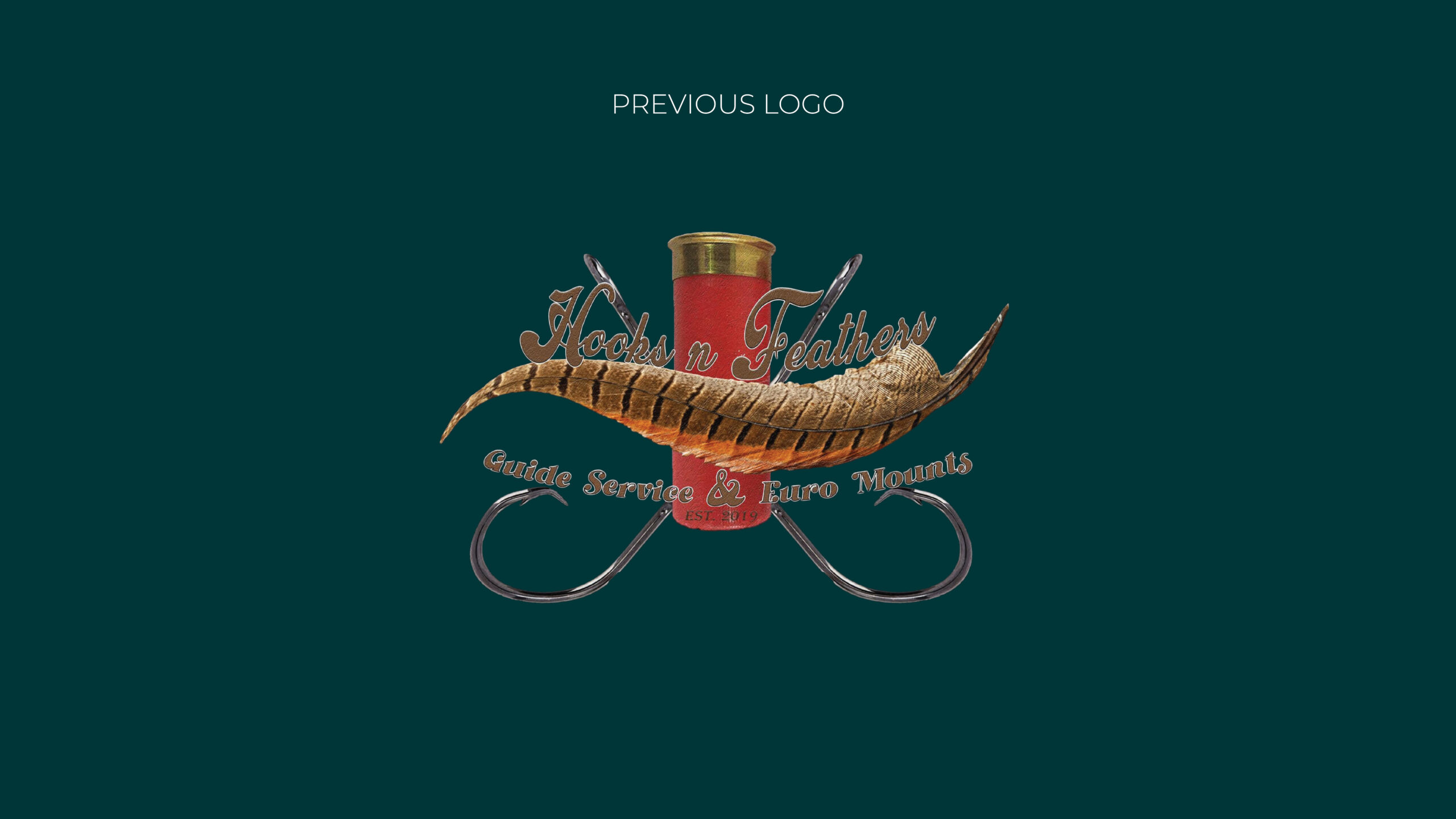
Hooks N’ Feathers is a fishing guide service that also offers a Euro mounting service, so the brand needed to feel just as at home in the woods as it does on the water. The client’s original logo was made from photographs, which made it difficult to read, visually busy, and hard to reproduce clearly across different applications.
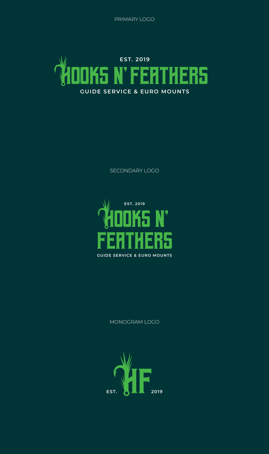
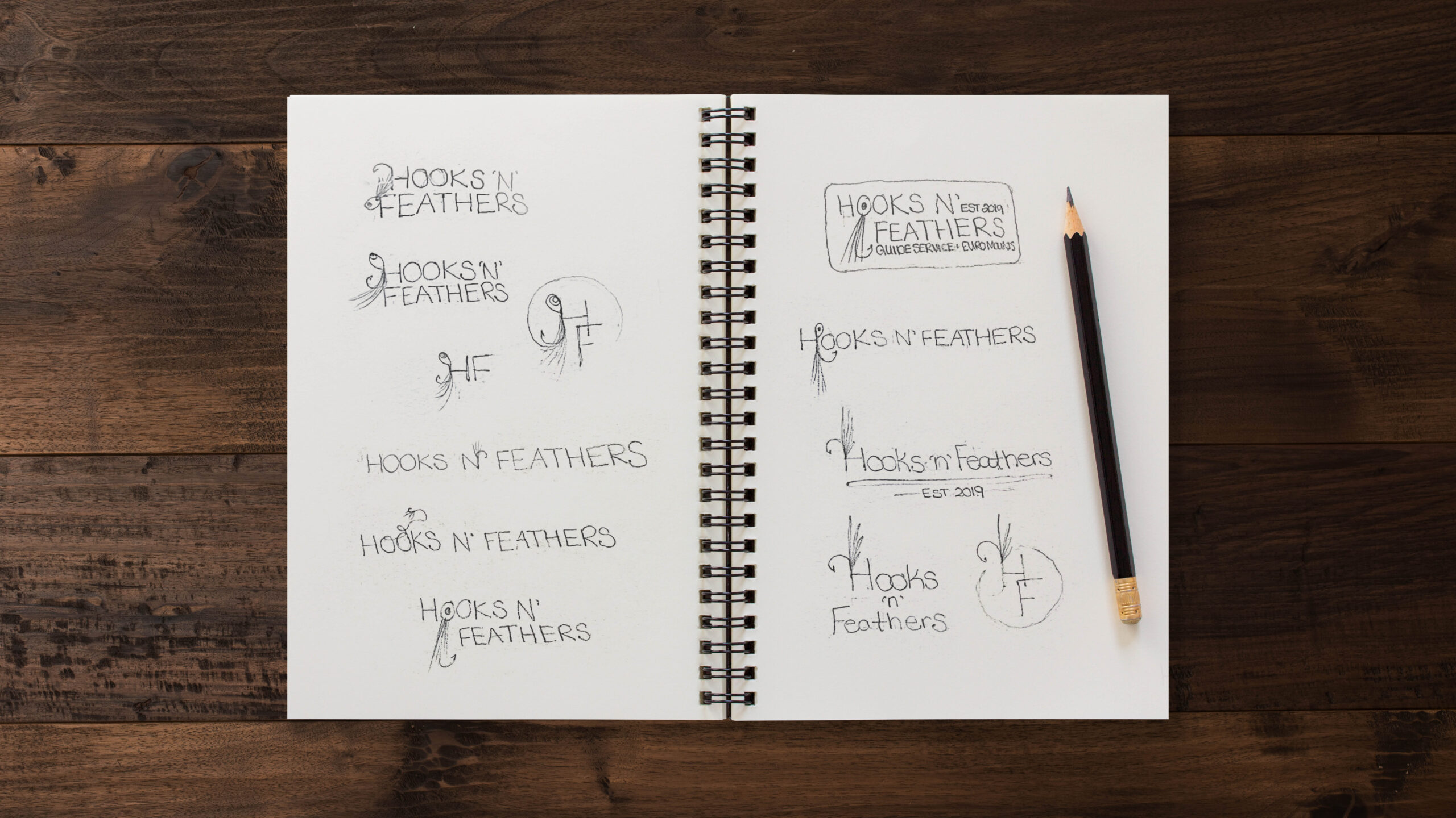
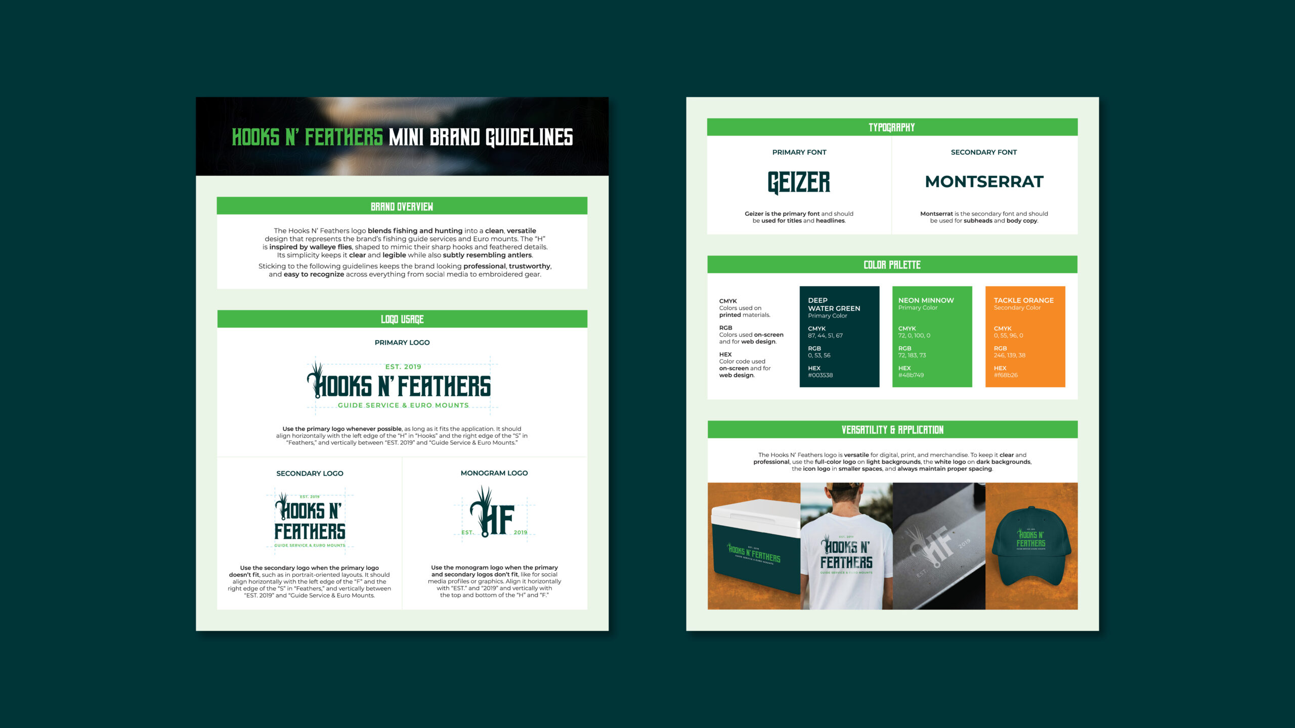
When the client came to me, they specifically requested that the new logo incorporate a walleye fly. I used that as my starting point, designing a sharp, simple mark where the “H” is inspired by walleye flies, echoing both hooks and feathered details. I also shaped the feather element into something that subtly resembles antlers, bringing in the Euro mount side of the business in a meaningful way.
The logo sets the tone, but the full visual identity pulls it all together. I designed everything with a rugged, masculine, and slightly rebellious feel, from the typography to the color choices. Geizer, with its sharp edges, gives the design a bold, structured look, while Montserrat adds just enough contrast to keep it clean and balanced.
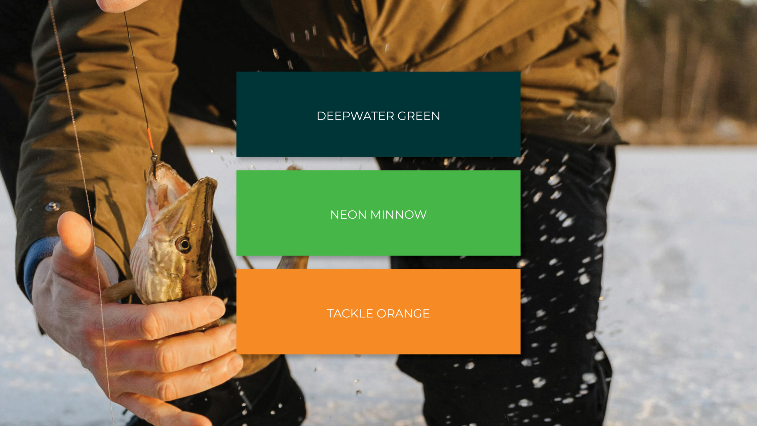
The color palette draws inspiration from the fishing and hunting world. Deepwater Green is inspired by Wisconsin lakes, Neon Minnow brings that high-visibility pop you’d expect from a lure, and Tackle Orange echoes the blaze colors hunters wear in the woods, adding bold energy and contrast.
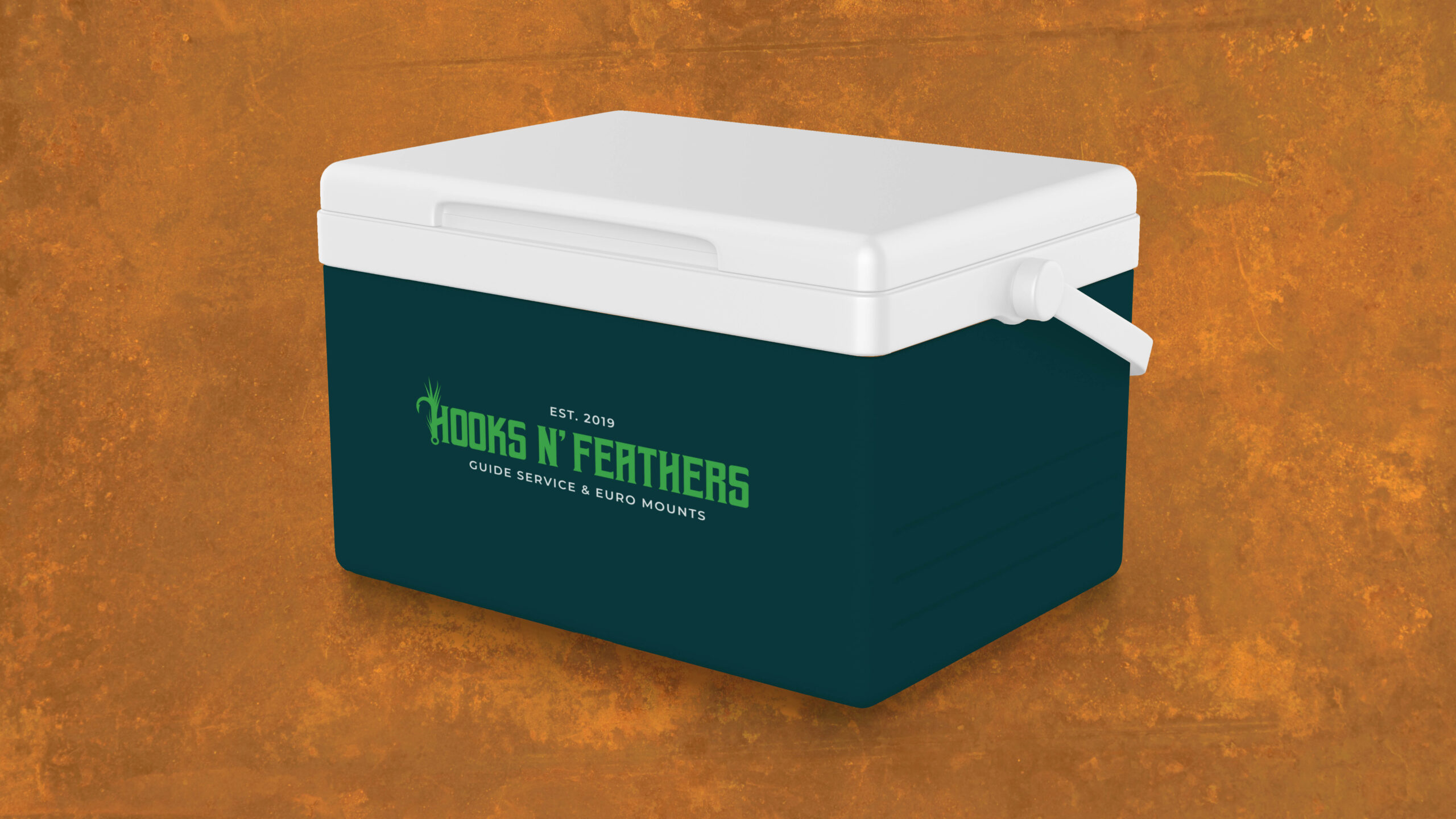
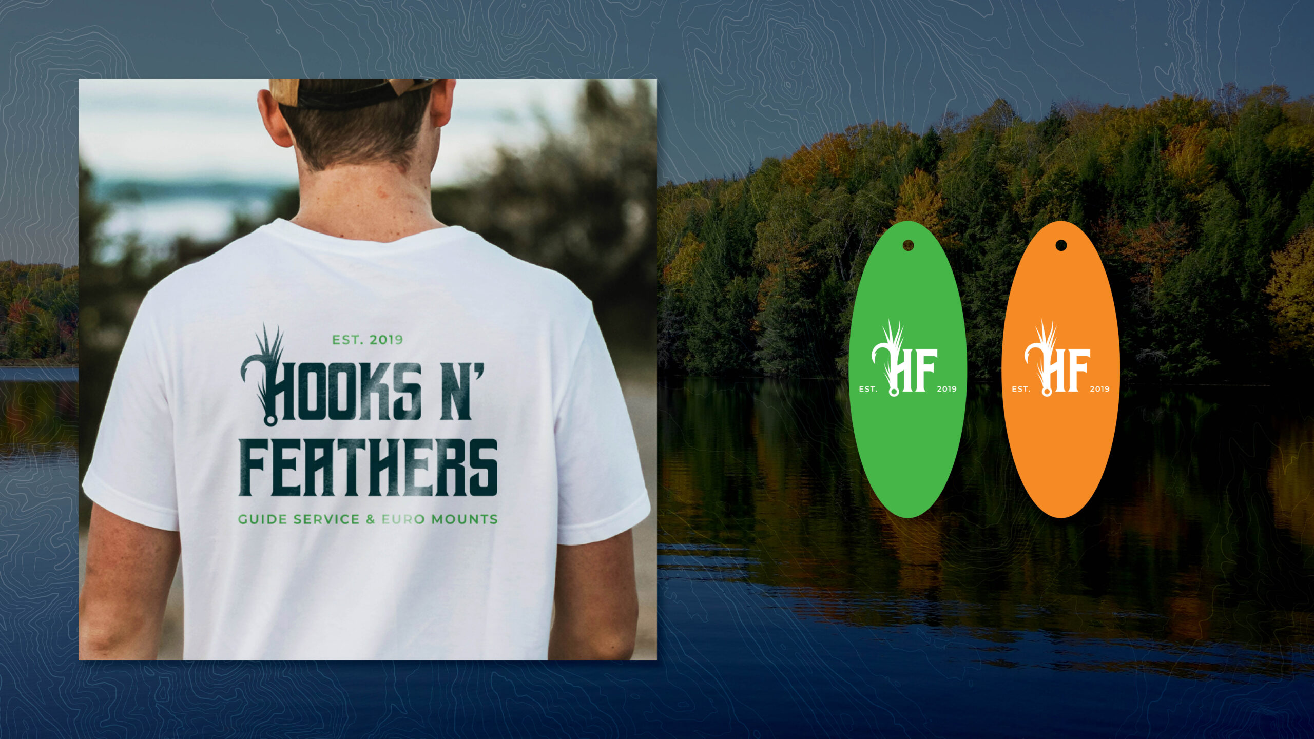
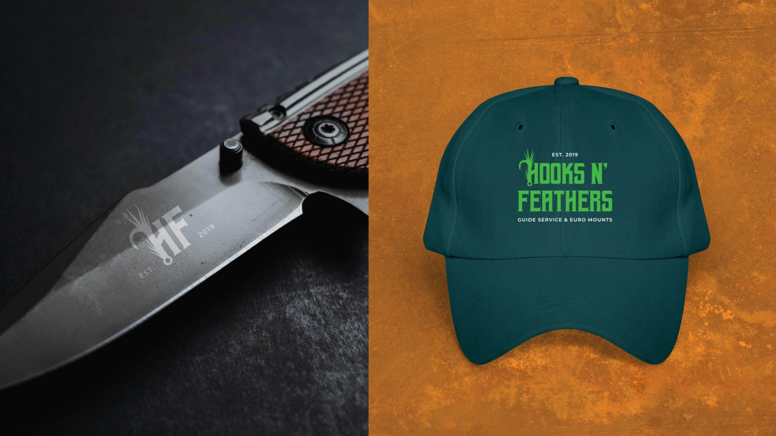
In a space full of fish logos that all start to look the same, this one stands out. It’s bold, clean, and built to hold up whether on a boat, in the woods, or stitched onto a baseball hat. Designed for hunters and anglers who take their craft seriously, Hooks N’ Feathers now has a visual identity that’s as dependable and sharp as the people it serves.
