Be Our Valentine
Fundraising campaign visual identity
The Be Our Valentine campaign for Habitat for Humanity of Waukesha County is all about spreading love, inspiring generosity, and helping local families build a better future. Since it runs each year around Valentine’s Day, the campaign leans into a theme of love, connection, and kindness, making it the perfect opportunity to design something heartfelt.
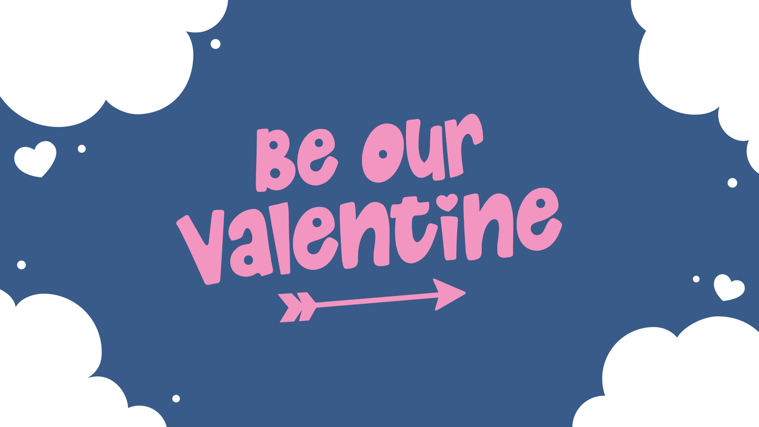
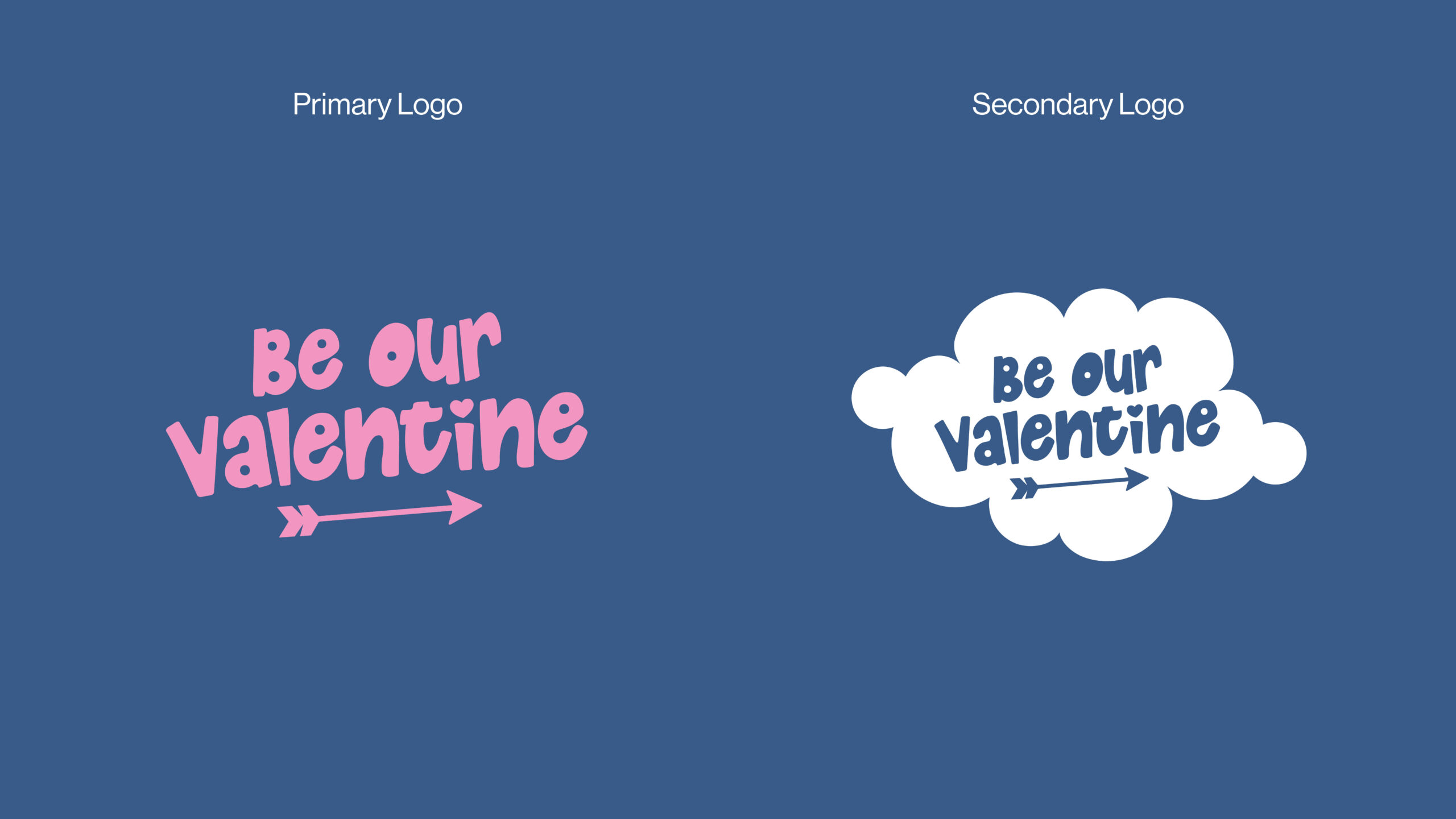
I created and donated a visual identity for the campaign, including a primary logo, secondary logo, and custom illustrations. To keep everything aligned with Habitat’s brand, I built on their approachable visual style, which often uses bold, rounded shapes and friendly forms. The campaign logo includes a small arrow tucked beneath the name—a nod to progress and support—and is paired with playful cloud illustrations to give it a dreamy vibe that feels approachable and cheerful.
For the color palette, I chose a soft pink and a deep navy. Pink adds warmth and love to the design, while navy keeps it feeling trustworthy and balanced. I used Little Paws as the main typeface for its fun, approachable personality and combined it with Habitat’s brand typeface, Neue Haas Grotesk Pro, for a polished, cohesive look.
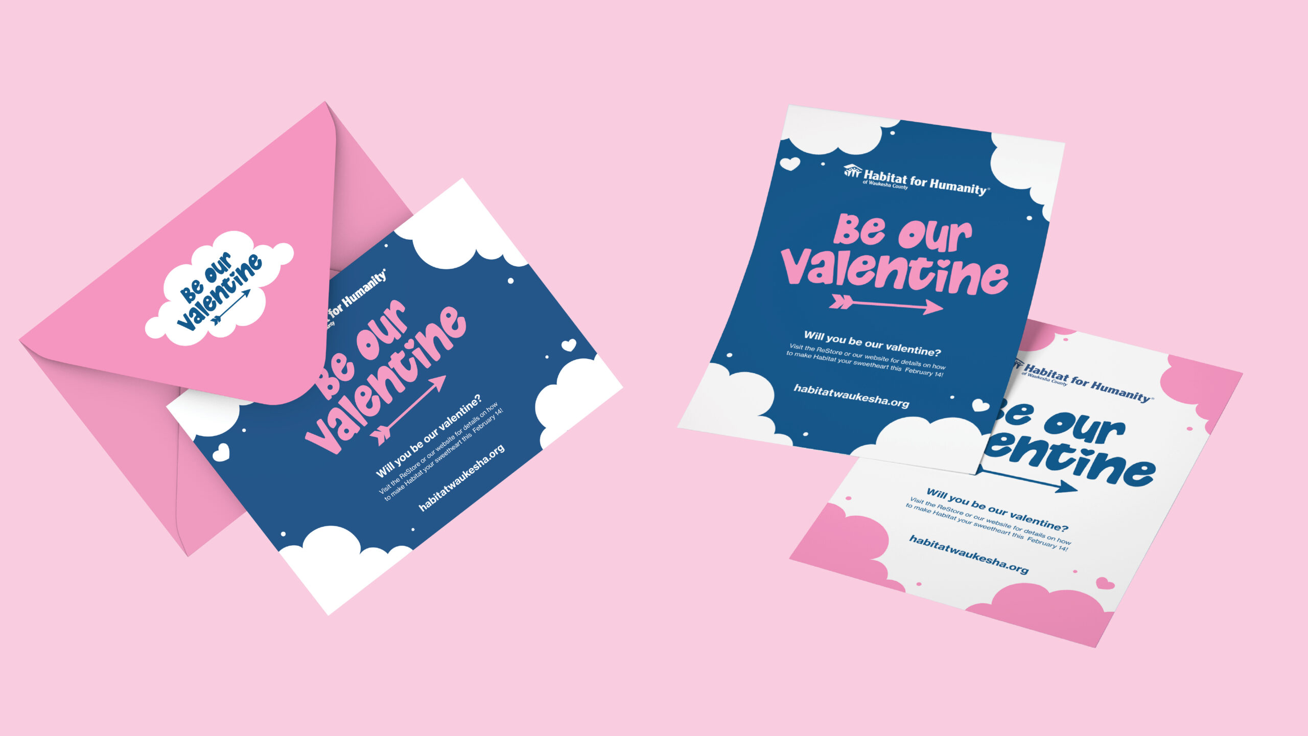
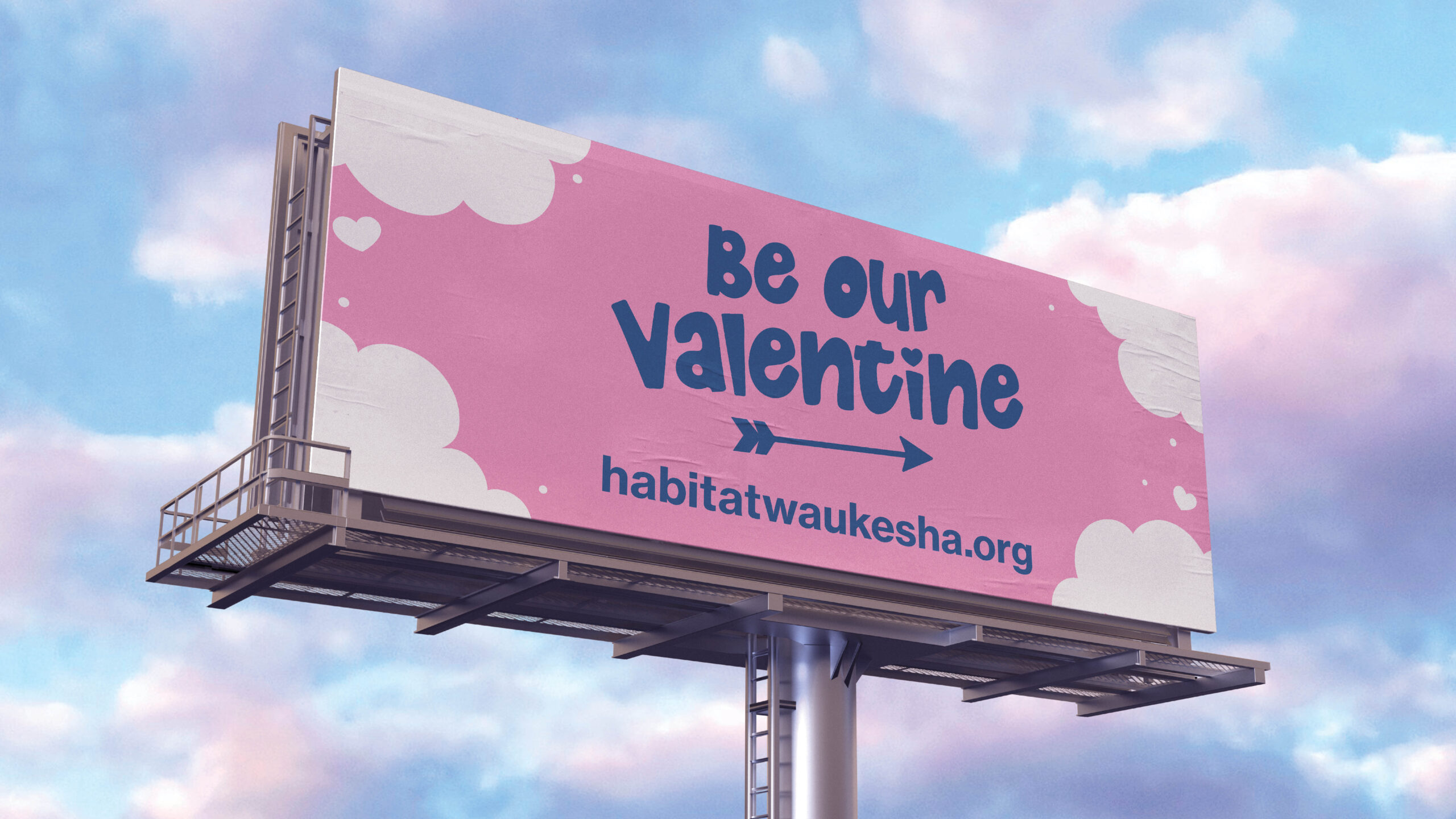
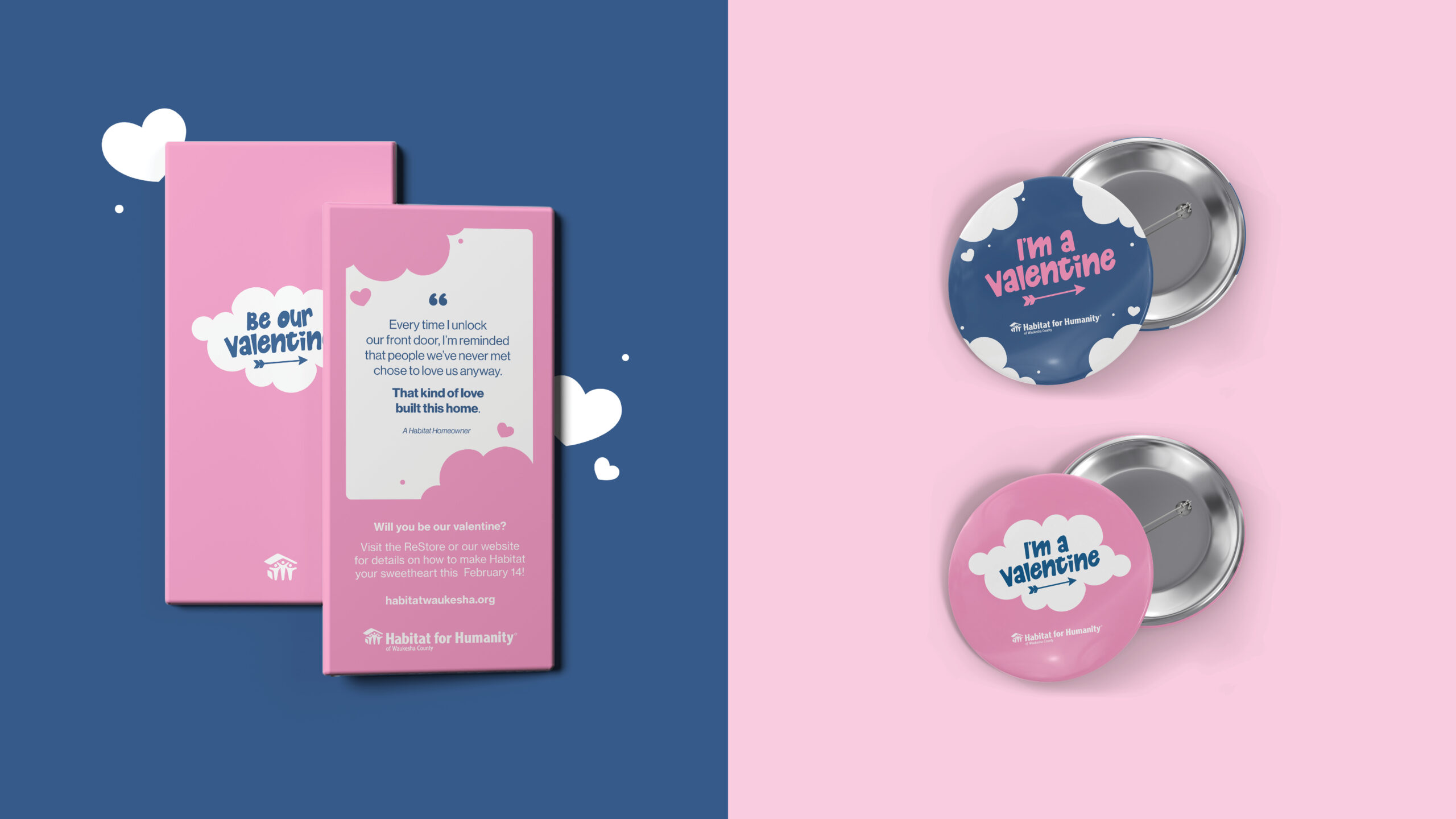
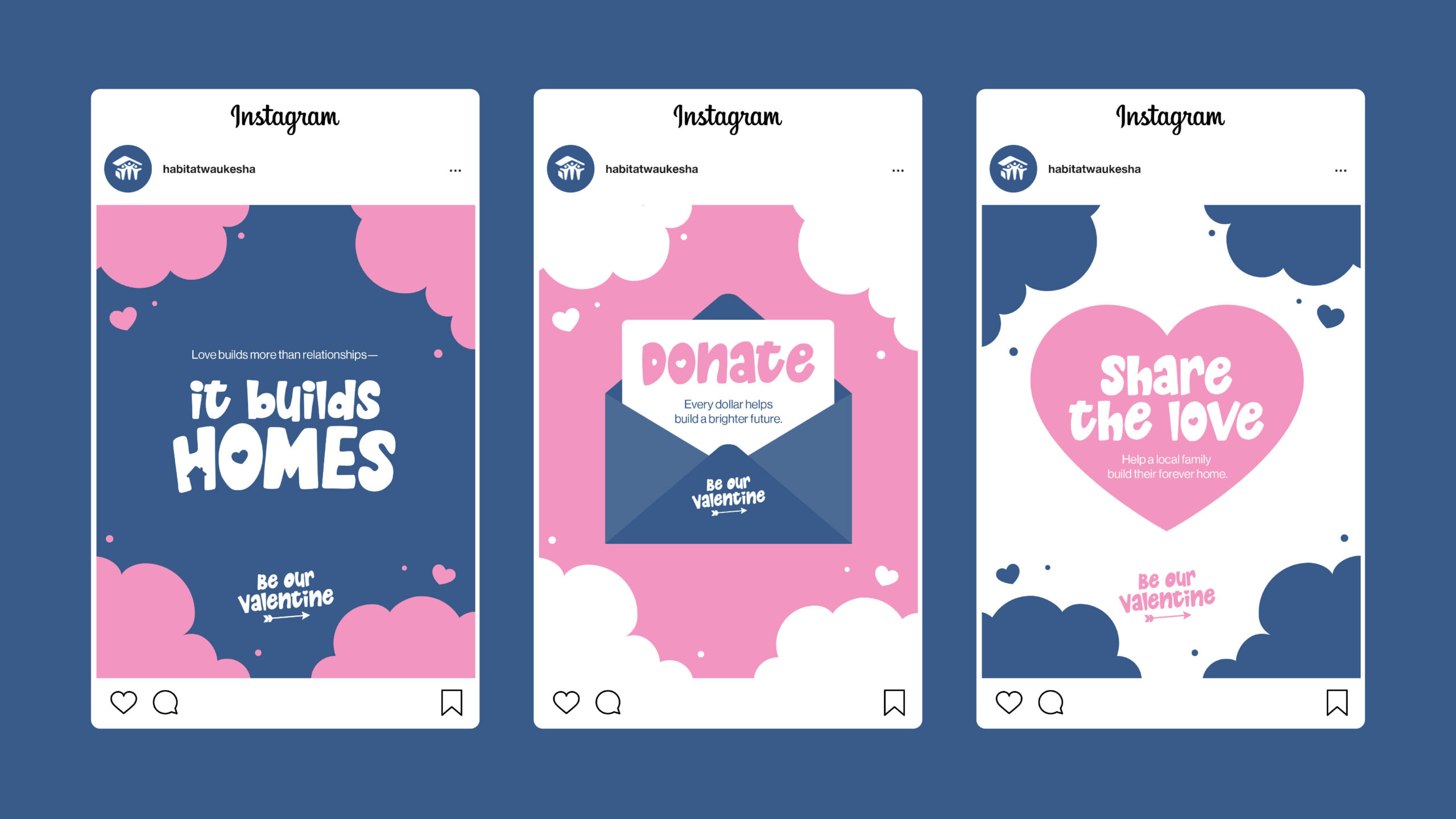
The full campaign suite included a flyer, mailed card, billboard, and social media graphics, all designed to capture attention and inspire donations. I also created a custom chocolate bar as a promotional item and wearable pins for donors to proudly show their support. Each piece was designed to feel inviting, hopeful, and true to the spirit of both the holiday and Habitat for Humanity’s mission.
This was a project that really let me blend emotion with strategy, something I love doing. Every detail was designed to connect with the community and remind people that love, when put into action, can help build homes and hope.
