Caffè Fiore
Visual brand identity
Caffè Fiore is a passion project that imagines a romantic Italian coffee bar experience. Though envisioned as a U.S.-based café, the brand was designed to transport guests to the Italian coast with every visit. It captures the feeling of waking up in Italy, surrounded by the scent of espresso and blooming flowers.
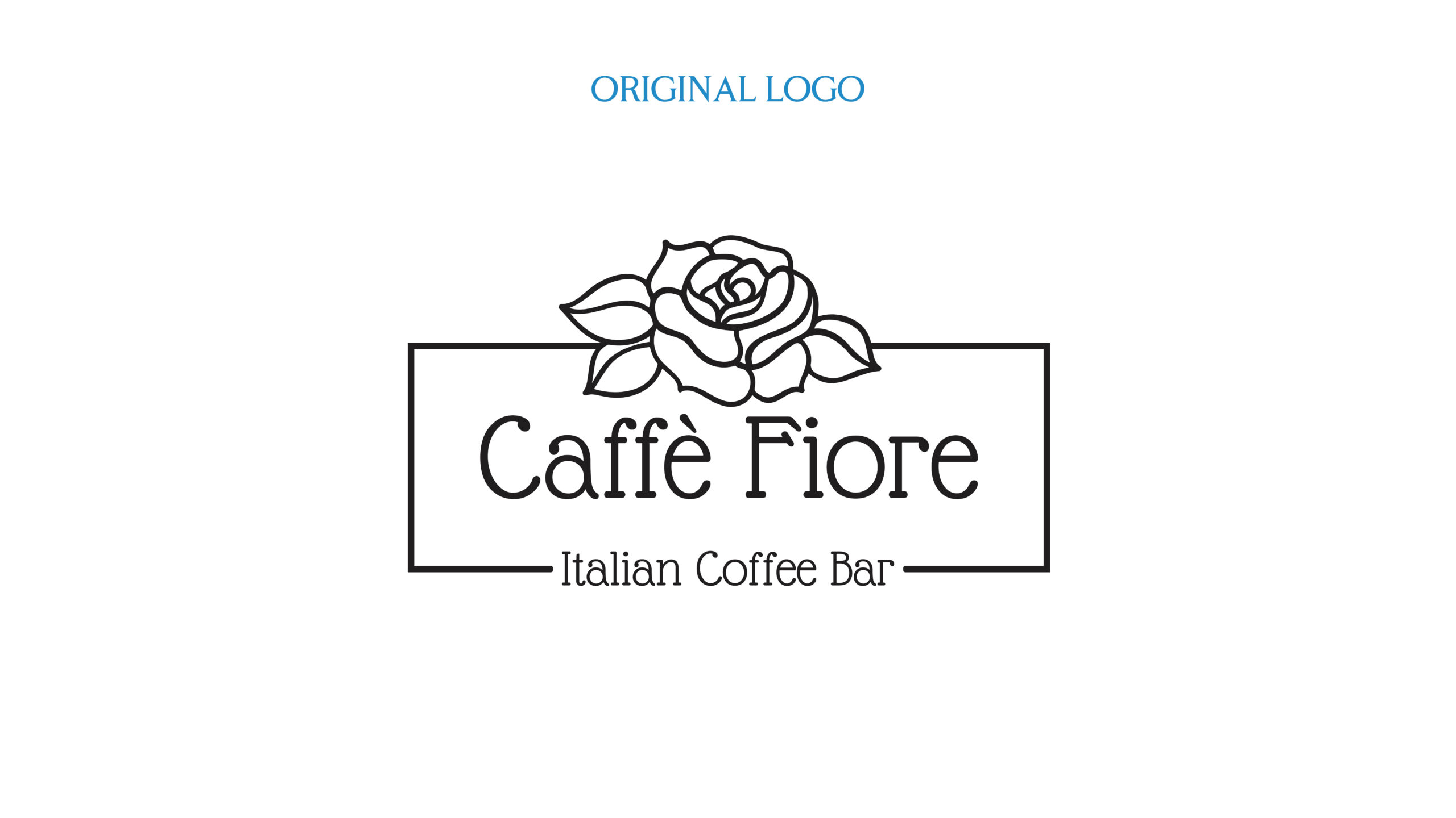
Originally created in 2020 to expand my design skills, this brand quickly became one of my favorites. I later revisited and redesigned it to reflect my growth as a designer. The original logo featured a typeface that was difficult to read, an unbalanced composition, and a tone that felt more playful than intended.
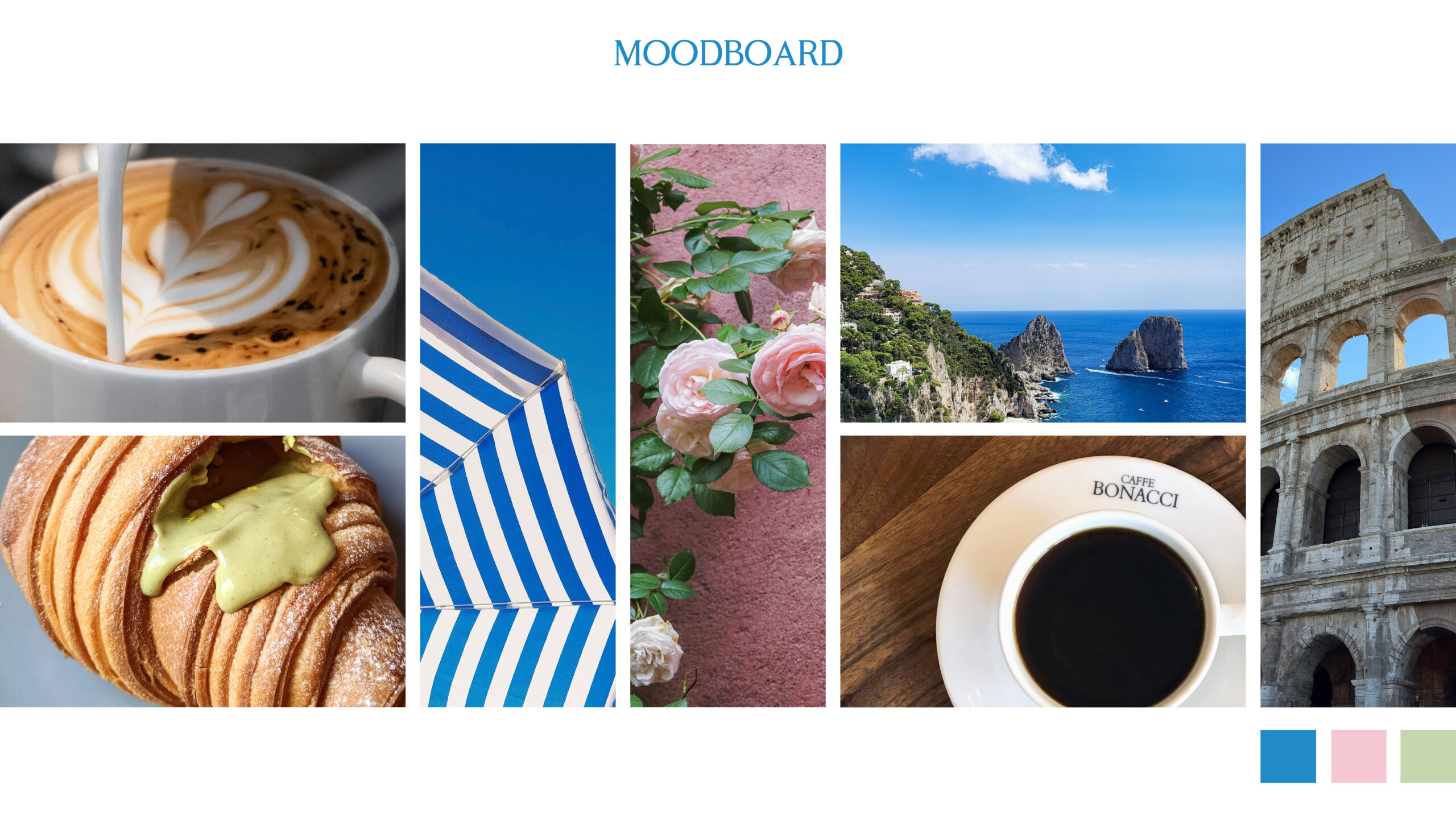
I wanted the brand to feel elegant and feminine, with a soft color palette and thoughtful design details throughout. The moodboard includes latte art, pistachio-filled cornettos, striped beach umbrellas, climbing flowers, the Italian coast, serif typefaces often seen in Italian cafés, and Roman arches.
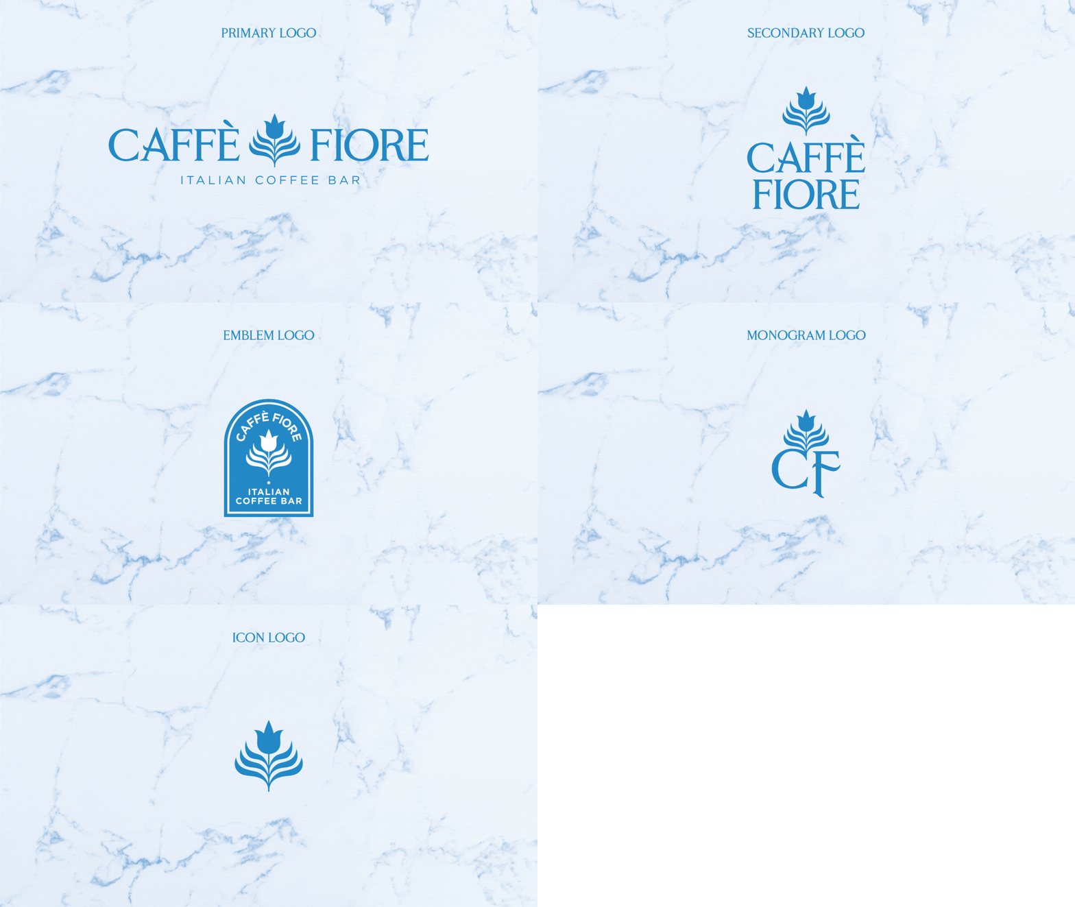
The primary logo features a custom rose-shaped latte art icon paired with Cobaissi, a serif typeface chosen for its romantic and floral-inspired curves. To create visual balance, Gotham was introduced as the secondary typeface, offering a clean, modern contrast to the ornate serif.
The full branding suite includes a vertical secondary logo, an emblem inspired by Italy’s architectural arches, a monogram featuring the rose and the initials C and F, and a simplified rose icon for versatile use.
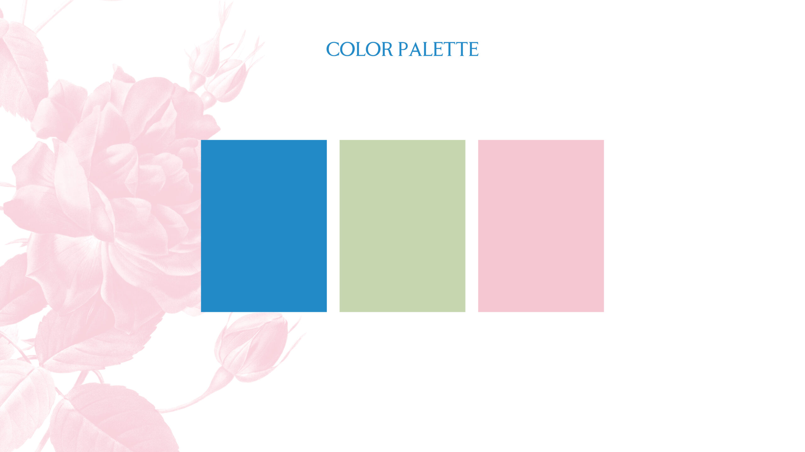
The color palette—Coastal Blue, Pistachio Green, and Petal Pink—captures the essence of Mediterranean landscapes, pistachio-filled cornettos, and delicate floral tones. Vintage floral patterns appear throughout the system, adding a sense of nostalgia and reinforcing the name Fiore, which means “flower” in Italian.
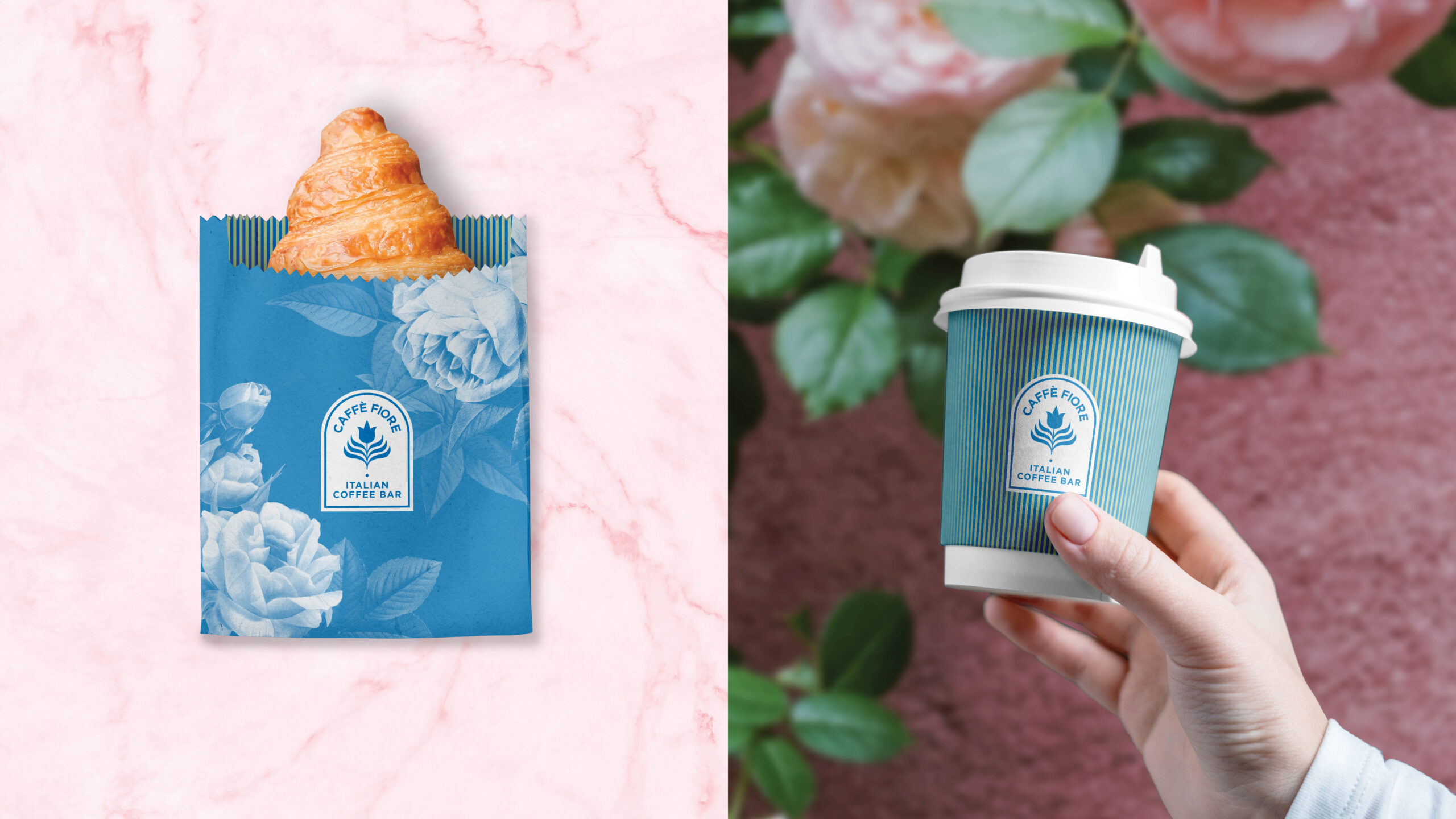
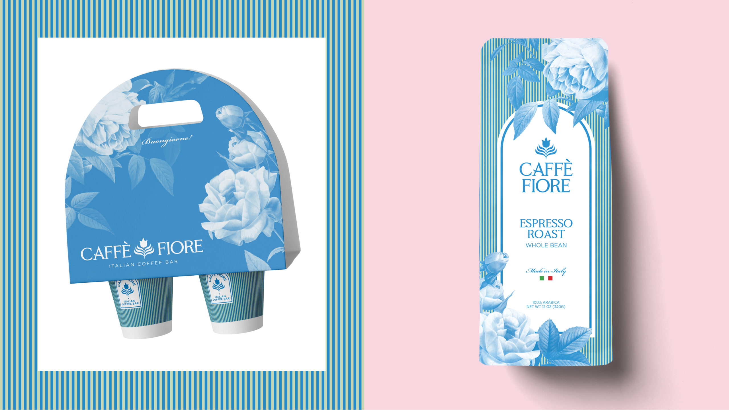
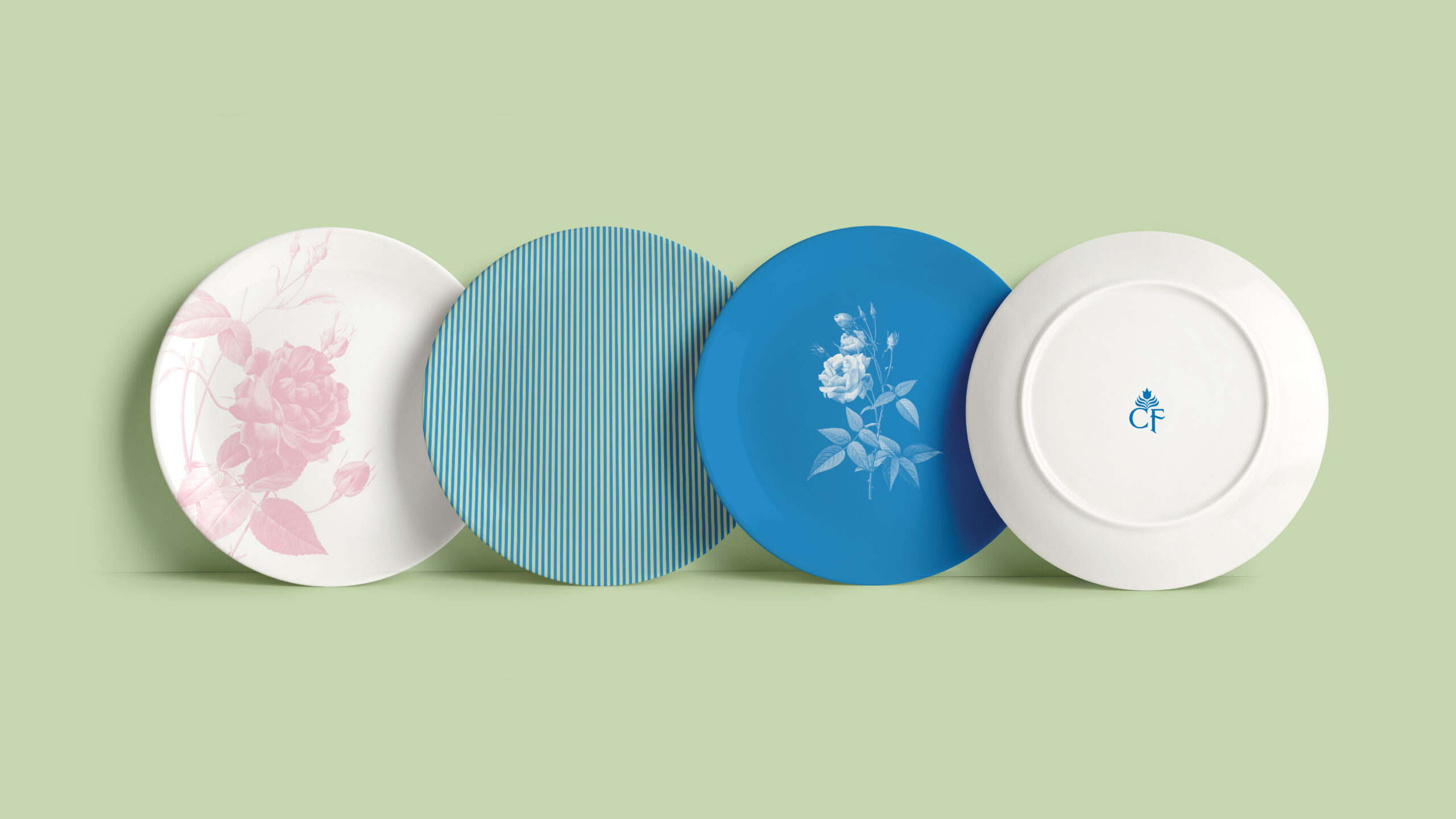
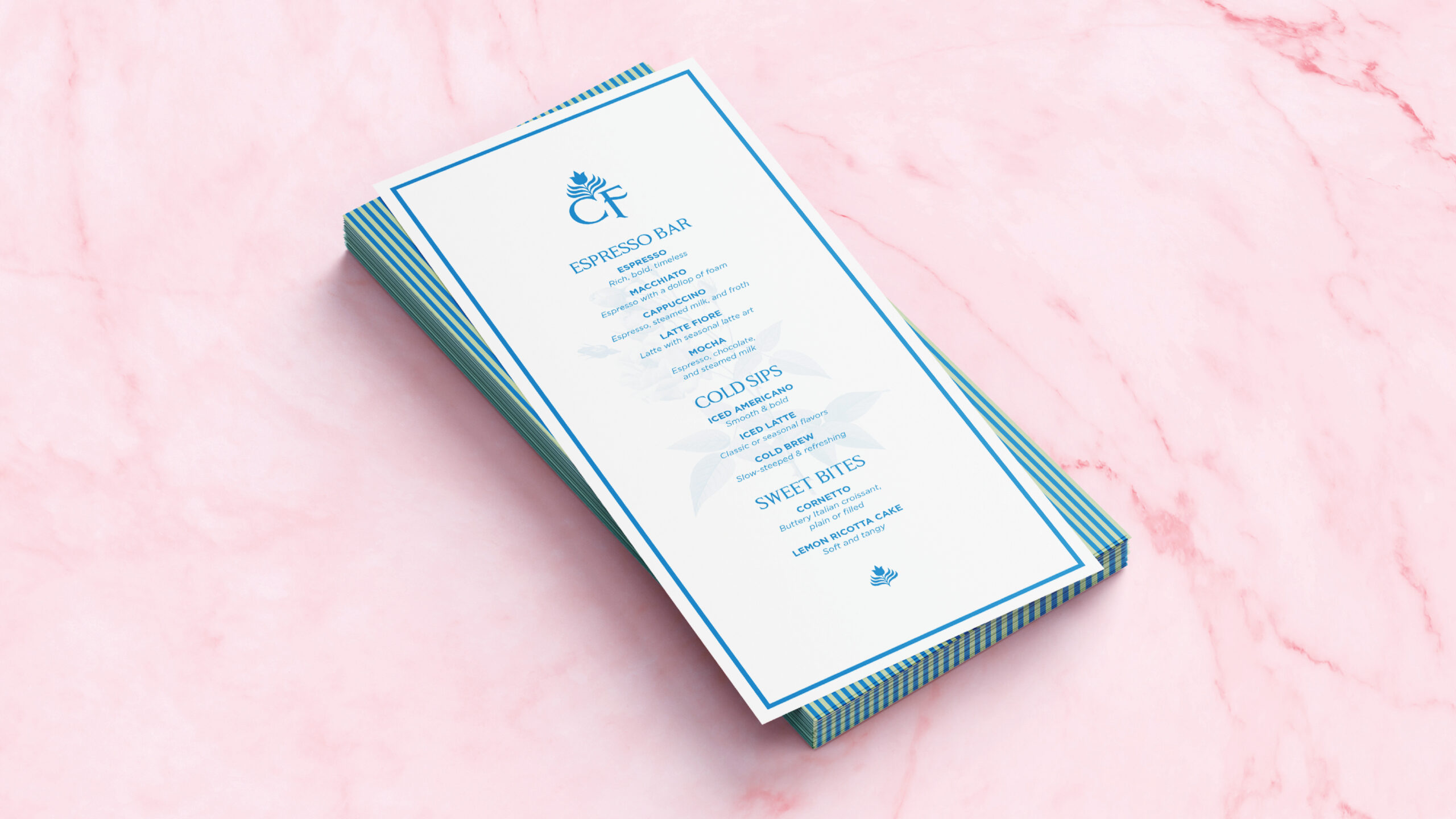
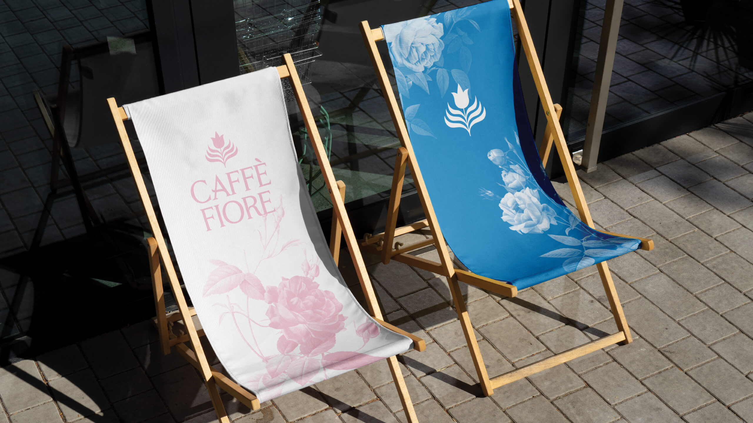
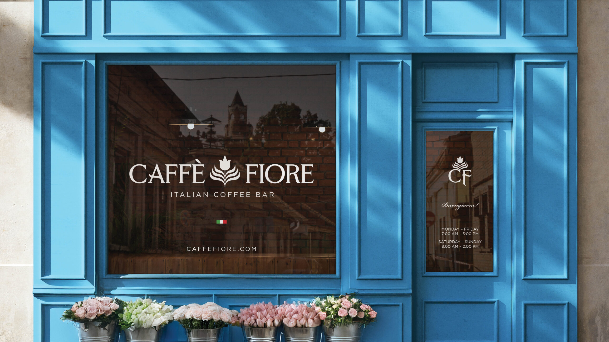
Brand applications I designed include pastry wraps, to-go cups and holders, espresso bags, custom plates, menus, sun chairs, and a storefront concept—all created to immerse customers in a rich, cohesive café experience.
This passion project allowed me to explore the intersection of beauty, culture, and intentional brand storytelling, celebrating two of my favorite things: coffee and design.
