Blue Barn Crafts
Brand identity
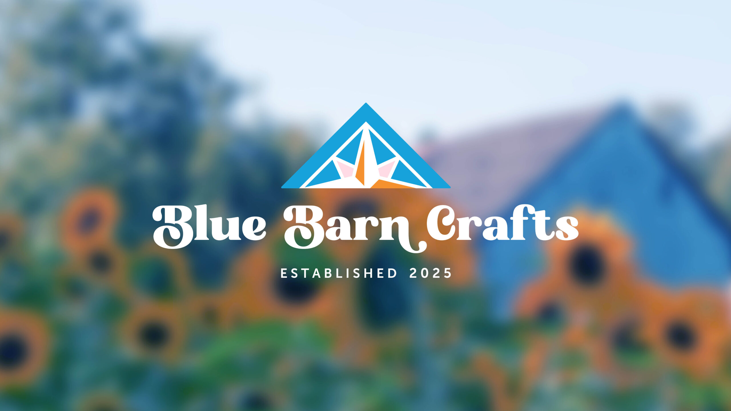
Blue Barn Crafts turns forgotten materials into handcrafted pieces full of charm, creativity, and second chances. When the client came to me, they mentioned wanting a barn in the logo. I loved the idea and took it a step further by focusing on the barn quilt painted on the actual barn where the crafts are made. It felt like the perfect symbol, rooted in tradition and personal to the business.
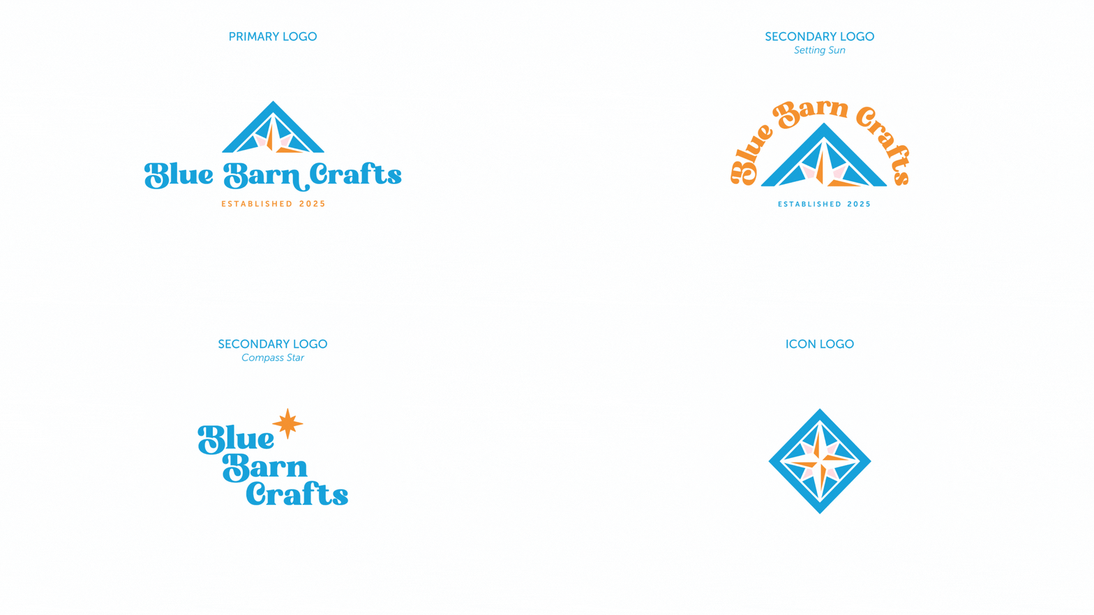
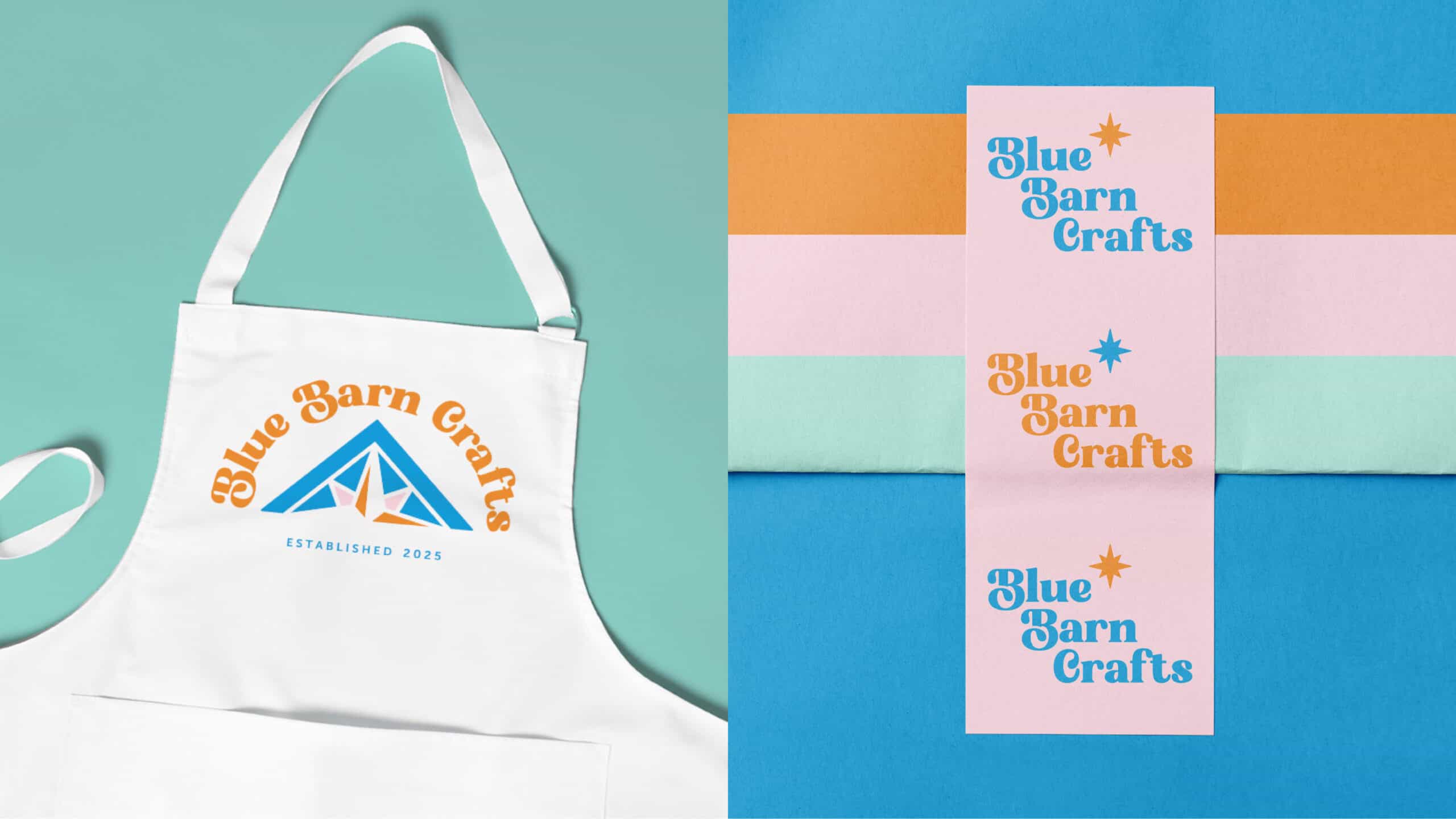
The primary logo puts that barn quilt front and center, reflecting the brand’s connection to craftsmanship and creativity. I also created a secondary logo with “Blue Barn Crafts” arched above the quilt, inspired by a setting sun to bring out feelings of warmth and nostalgia. For more variety, there’s a compass star version that adds a playful, mid-century modern vibe, and a submark that keeps the quilt pattern as the focus for smaller applications.
For typography, I paired the retro character of Bright Sunlist with the clean, friendly style of Museo Sans.
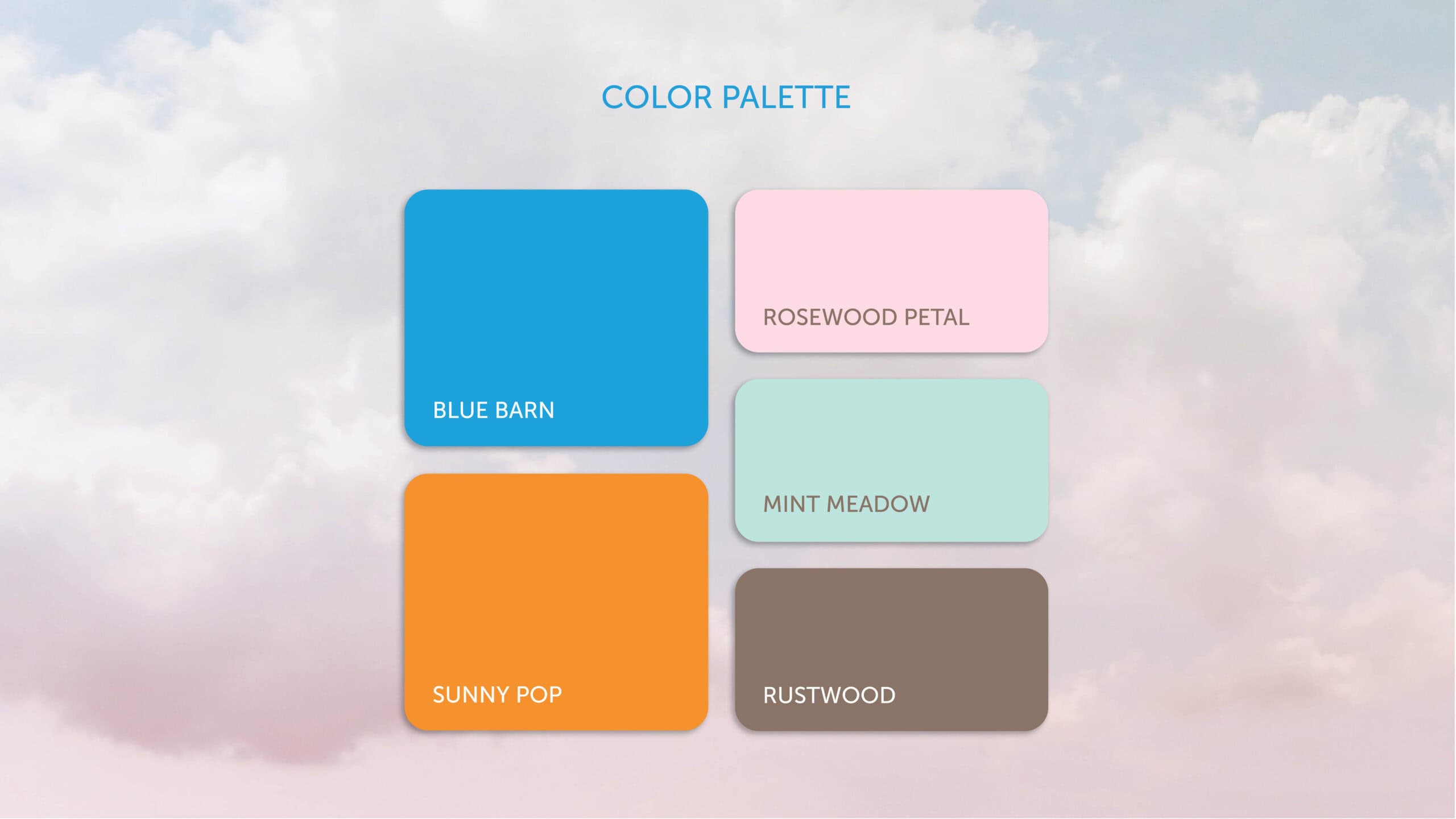
The color palette features bold, vintage-inspired tones like Blue Barn and Sunny Pop, with supporting colors like Rosewood Petal, Mint Meadow, and Rustwood.
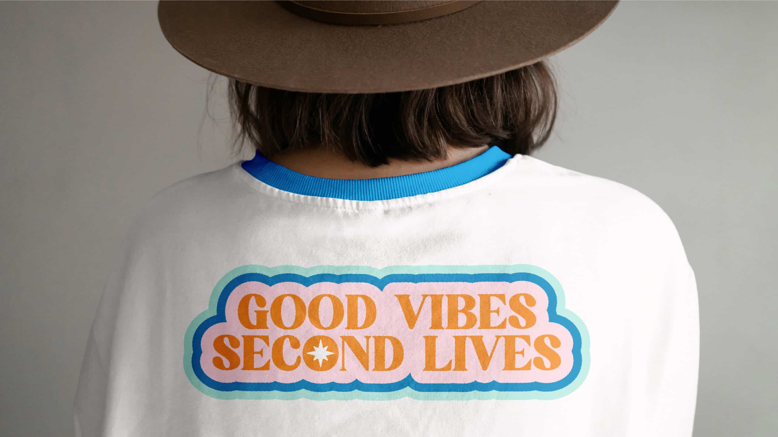
To reinforce the brand’s upbeat, eco-friendly spirit, I came up with the phrase “Good Vibes, Second Lives” and designed it as a cheerful graphic. It shows up on items like t-shirts and pins to add personality and spread the brand’s message in a fun way.
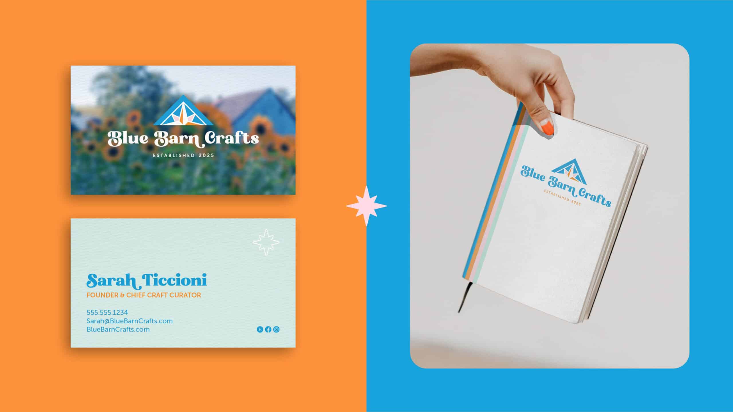
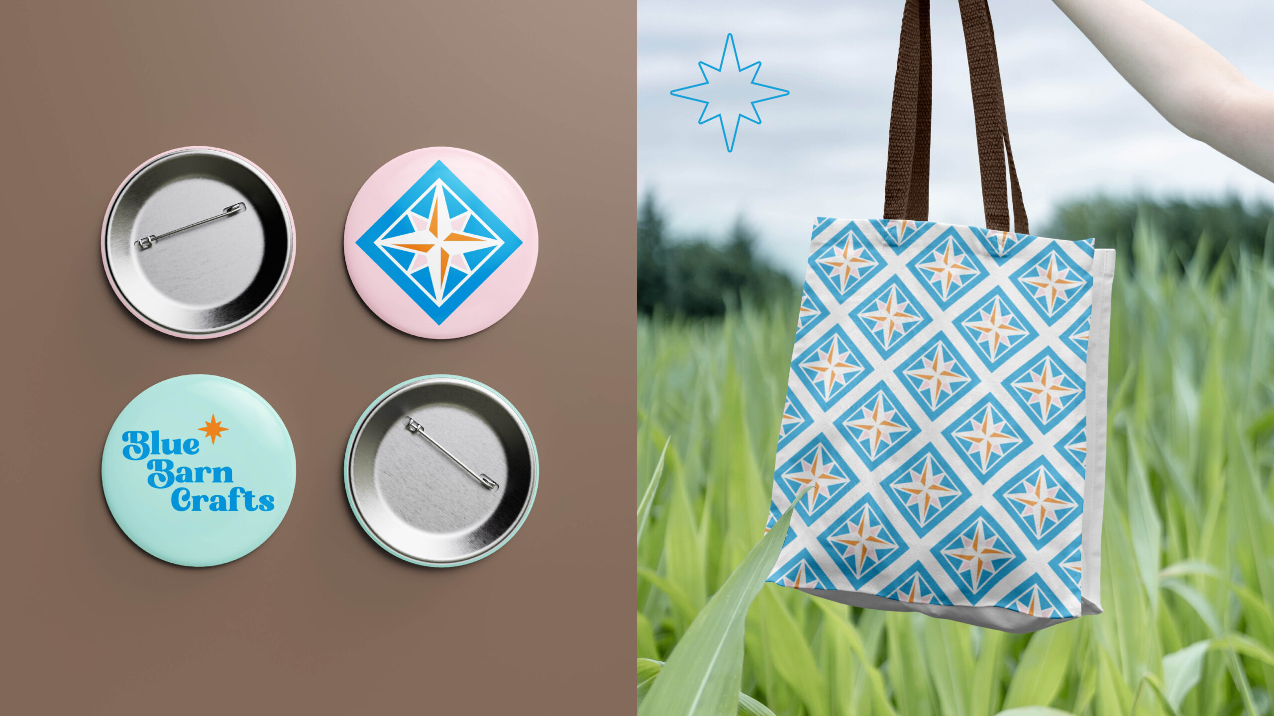
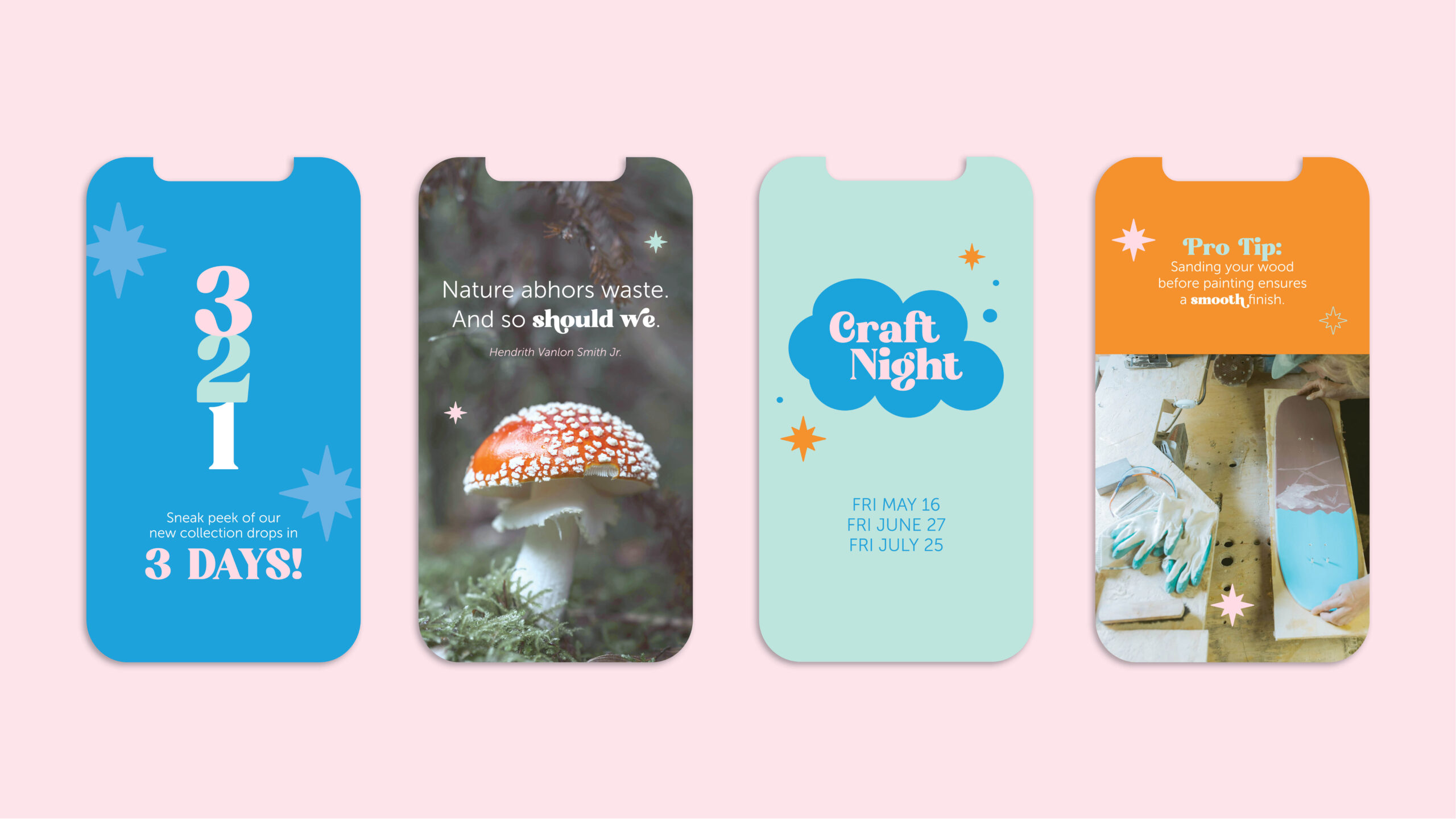
All of these pieces come together across print and digital brand materials, including business cards, sketchbooks, aprons, wrapping paper, wearable pins, tote bags, and social media graphics, bringing the heart of Blue Barn Crafts to life in every detail.
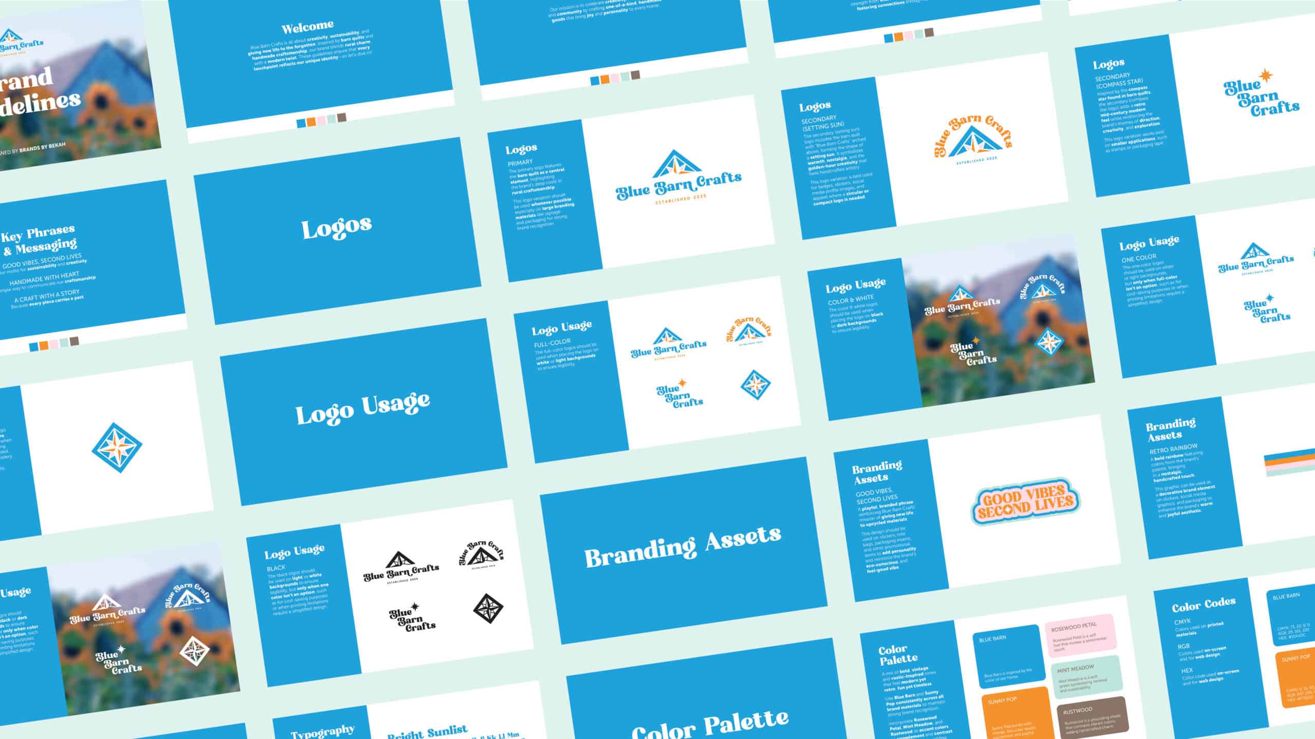
I also created brand guidelines to help ensure consistency across future materials. These include the brand’s mission, values, tone of voice, logo usage, color values, font details, and more.
